Caring Hands App
Case Study · Mobile App · Social Impact Design

Caring Hands
Volunteer App

Connecting willing volunteers with seniors and disabled individuals who need help with everyday physical tasks — so both communities benefit.

Duration
Dec 2022 – Jan 2023
2 months
My Role
UX Researcher
UI Designer
Tools
Figma
Wireframing · Prototyping
Platform
iOS Mobile App
Social Impact
01 — Overview

A bridge between
those who need
and those who give

Not everyone can afford to hire someone to help with tasks like shovelling snow or mowing the lawn. At the same time, there are citizens in our community who are genuinely willing to lend a hand to seniors or those with disabilities.

"The majority of interviewees responded positively — indicating their willingness to support community-based help."

Caring Hands acts as a bridge between these two groups — connecting them so that both can benefit from the exchange.

🤝
The Problem
Seniors and disabled individuals struggle with physical chores like snow shovelling and lawn mowing — and not all of them can afford paid services to help.
🎯
The Goal
Connect volunteers who are willing to help with those who need assistance — creating a safe, trusted platform that benefits both sides of the community.
💜
Why it matters
This isn't just a design challenge — it's a social one. The app needed to build trust between strangers, which required exceptional care in every design decision.
02 — User Research

Understanding both sides

This project required understanding two very different user groups simultaneously — those who need help, and those willing to give it. I conducted interviews with both groups to capture their distinct needs and concerns.

User Research Summary

User research summary — key insights from both user groups

01
Physical limitations
Seniors and disabled users physically cannot perform certain tasks — not a matter of preference, but of genuine need and safety.
02
Financial constraints
Paid services are often unaffordable for those on fixed incomes or with limited resources — leaving many without any viable option.
03
Trust and safety
Both groups needed assurance — users needed to trust volunteers coming to their homes, and volunteers needed a safe platform to connect through.
04
Community connection
Many volunteers simply didn't know how to find people who needed help in their area — the connection point was missing.
03 — Personas

Designing for two
distinct users

Unlike most projects, Caring Hands required designing for two fundamentally different personas simultaneously — each with conflicting needs that both had to be served equally well.

Persona Adelaide
Persona 1 — The User
Adelaide
A disabled user who needs help with tasks such as snow shovelling or lawn mowing — her condition makes it impossible for her to do them independently. She needs to trust anyone who comes to her home.
Persona Hans
Persona 2 — The Volunteer
Hans
A student and part-time worker who wants a safe platform to connect with people needing assistance — because he believes in giving back to his community but doesn't know where to start.
04 — User Journey Maps

Two journeys, one platform

Mapping both user journeys side by side revealed the critical moments where the experience had to work for both personas simultaneously — particularly around trust, matching, and task confirmation.

Journey Map Adelaide

Adelaide's journey — requesting help with snow shovelling

Journey Map Hans

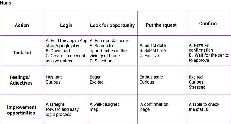
Hans's journey — finding someone nearby to help and completing a task

05 — Competitive Audit

Learning from the landscape

I conducted a competitive audit of both direct and indirect competitors to identify their strengths and weaknesses — looking for gaps in the market that Caring Hands could fill.

Competitive Audit

Competitive audit — direct and indirect competitor analysis

🔍
Gap identified
No existing platform specifically connects community volunteers with seniors/disabled individuals for everyday physical tasks.
🛡️
Trust gap
Competitors lacked robust trust features — no verification, reviews, or safety mechanisms for vulnerable users.
📍
Location gap
No competitor offered hyper-local matching based on proximity for time-sensitive tasks like snow shovelling.
06 — Design Process

From sketch to screen

01
Paper wireframes
Rapid ideation on paper
02
Digital wireframes
Structure & dual flows
03
Lo-fi prototype
Clickable for testing
04
Usability studies
2 rounds of testing
05
Hi-fi prototype
Final polished design

Paper Wireframes

Starting with paper allowed rapid exploration of the dual user flow — how the app would serve both Adelaide and Hans with a single, unified interface.

Paper Wireframes

Early paper sketches — exploring dual user flows on a single platform

Digital Wireframes

Moving to Figma, I built digital wireframes focusing on the task request flow, volunteer matching, and the critical trust-building touchpoints throughout the experience.

Digital Wireframes

Digital wireframes — task request and volunteer matching flows

Low-Fidelity Prototype

The clickable lo-fi prototype enabled the first round of usability testing with real participants from both target groups.

Lo-Fi Prototype

Lo-fidelity prototype — complete dual user flow mapped in Figma

07 — Usability Studies

Testing with real users

I conducted two rounds of usability studies before finalising the design — testing with participants from both user groups. This dual-testing approach was essential to ensure the platform worked for everyone.

🔍
Finding 1 — Task clarity
Participants were unsure how to specify exactly what help they needed. Solution: redesigned the task creation flow with clearer category selection and description prompts.
🔍
Finding 2 — Volunteer discovery
Volunteers struggled to find tasks near them quickly. Solution: added a map view and proximity-based filtering to surface nearby requests immediately.
🔍
Finding 3 — Trust signals
Both groups needed more visible trust indicators. Solution: added volunteer verification badges, ratings, and a confirmation step before any task is accepted.
Usability 1

Round 1 findings

Usability 2

Round 2 findings

Usability 3

Iteration insights

08 — Final Design

The finished product

After two rounds of usability testing and iteration, the final high-fidelity screens were designed — with particular attention to accessibility, legibility, and trust throughout the experience.

Screen 1
Screen 2
Screen 3
Screen 4
Screen 5
Screen 6
Screen 7
Screen 8

High-Fidelity Prototype

Hi-Fi Prototype

High-fidelity prototype — final screens ready for development handoff

Explore the prototype

Click through the full interactive Figma prototype to experience both user flows.

Open in Figma ↗
09 — Accessibility

Designed for everyone,
especially those who need it most

Given that a core user group has physical disabilities, accessibility wasn't optional — it was the foundation of every design decision.

01
High contrast
High contrast colours and fonts throughout — making text easy to read for users with visual impairments or low vision.
02
Plain language
Clear and simple language across all screens — designed for users with cognitive disabilities or limited digital literacy.
03
Large touch targets
All gestures and buttons are easy to activate with minimal effort — accommodating users with limited dexterity or motor impairments.
10 — Reflection

What I learned

Caring Hands was the most emotionally significant project of the three. Designing for vulnerable users requires a different kind of empathy — one that goes beyond usability into genuine care for human dignity and safety.

Key insight
Designing for two opposing user groups at once is one of the hardest UX challenges. Every feature had to serve both Adelaide and Hans without compromising either experience.
Design lesson
Trust is not a feature — it's a feeling built through dozens of small design decisions. Verification, ratings, confirmations, and clear language all stack together to create it.
Next steps
Add a real-time task tracking feature, explore voice-first interactions for users with motor impairments, and test with a broader age range of participants.